Emir
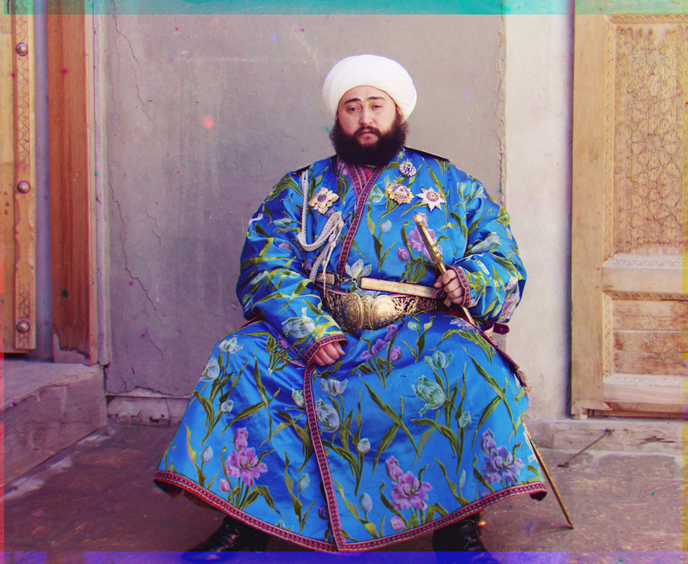
TIF, Green Base, Depth: 5
Displacement vector B: (-22, -50)
Displacement vector R: (16, 58)
Sergei Mikhailovich was the man that pioneered color photography. Even though he lived at a time where there was no way to print color photographs, he envisioned a solution and recorded the exposures of different scenes onto a glass plate using three filters; red, green and blue. He traveled across the Russian Empire producing colored pictures and capturing the last years of the Russian Empire, leaving us a way into visualizing the past. Through computer graphics we can aim to achieve the thing that Sergei did with no technology; align the three filters in order to create a colored photograph.
For all the images the first thing I did was to crop the black boarders out and a percentage of pixels from each of the sides. For the jpg images I cropped 10% and for the tif images I cropped 15%. To score the displacement of the images I implemented Euclidean distance, NCC, and SSIM. SSIM took considerably longer to run and between Euclidean distance and NCC I saw better results with NCC which is why I decided to use this one.
For the smaller jpg images I exhaustively searched over a window of possible displacements and took the displacement with the best score over a range of [-15, 15] pixels. This part of the project was specially easy going.
When looking at the bigger tif images, the project got more complicated. I implemented the pyramid methodology recursively. At the beginning I decreased the size of the window by a factor of 0.7 as I moved from a smaller frame to a bigger frame. Nonetheless, to optimize my solution I decided to only leave a window of [-15, 15] for the base case (smallest frame) and take a [-2, 2] window for the rest of the frames. This approach worked well and sped up my code significantly. One of the trickiest parts was to figure out what depth was needed for each one of the images. For this I tested different depths per image and visually saw what depth was better for each. Additionally, while doing the project I realized that some images align better depending on the color we use for the base. This is why for the images that where mostly green or yellow, I used the green filter as the base. From there, the alignment became much better.

TIF, Green Base, Depth: 5
Displacement vector B: (-22, -50)
Displacement vector R: (16, 58)
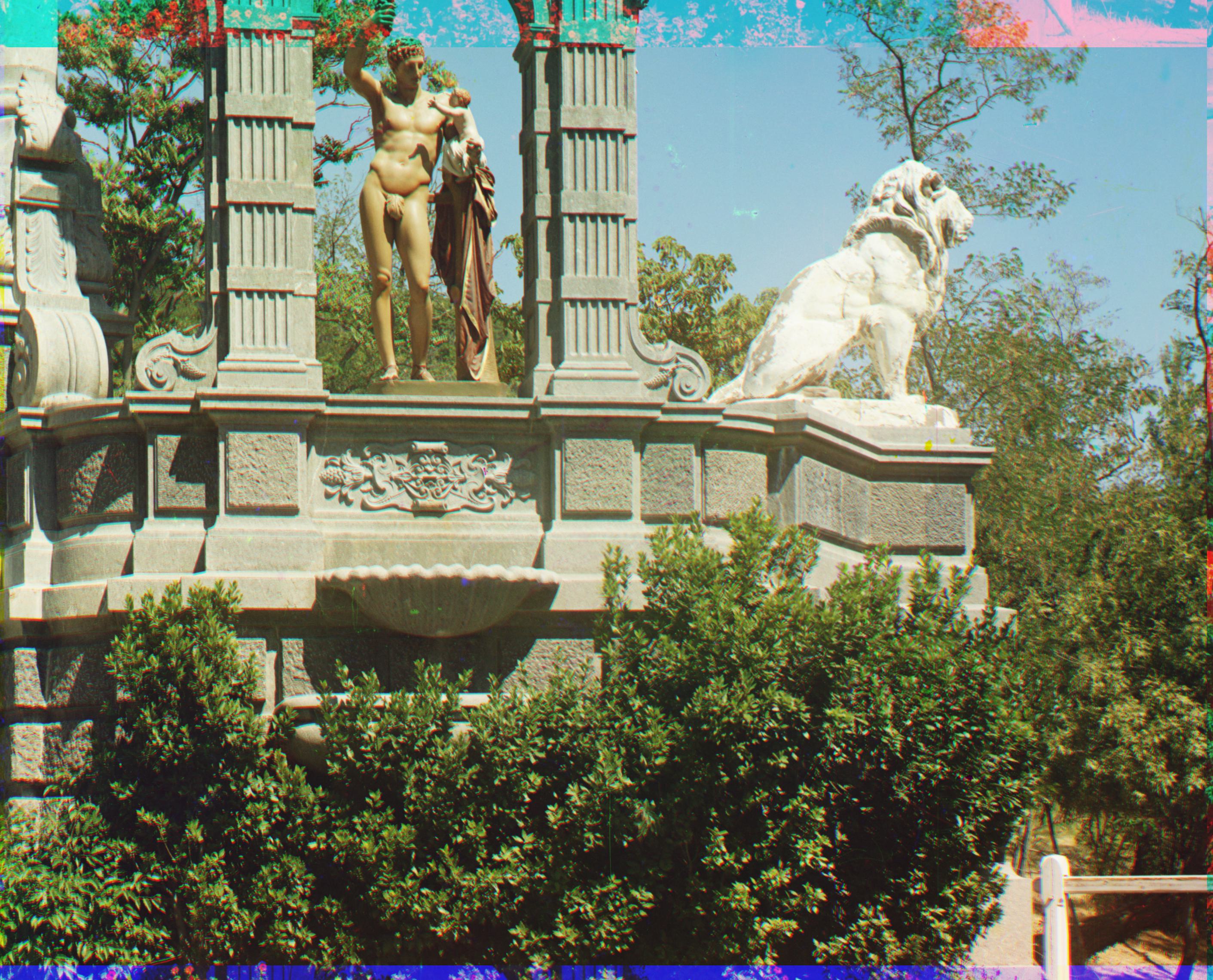
TIF, Green Base, Depth: 5
Displacement vector B: (10, -34)
Displacement vector R: (-14, 62)
TIF, Green Base, Depth: 6
Displacement vector B: (-16, -42)
Displacement vector R: (5, 50)
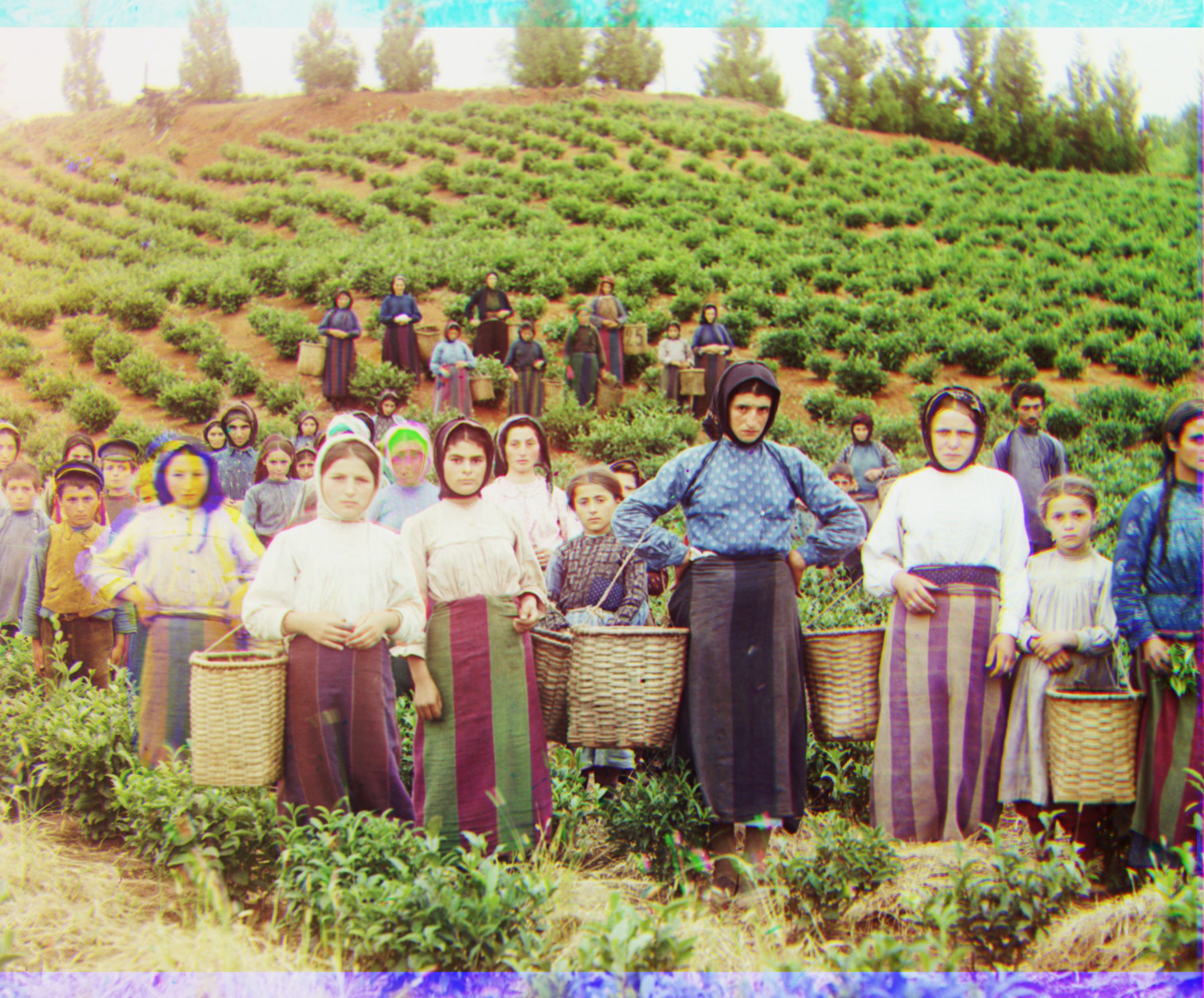
TIF, Green Base, Depth: 4
Displacement vector B: (-16, -59)
Displacement vector R: (-3, 62)
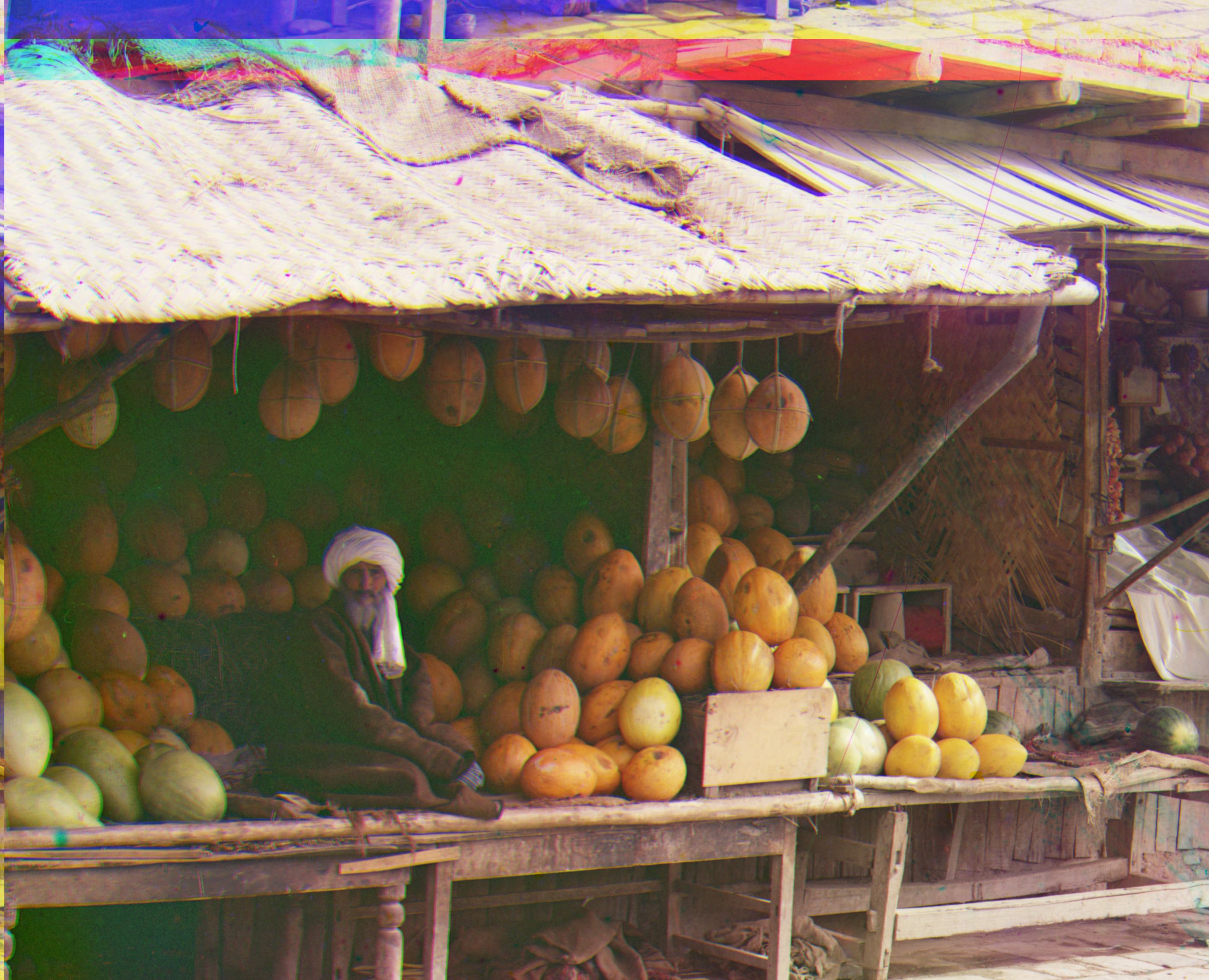
TIF, Blue Base, Depth: 6
Displacement vector G: (4, 62)
Displacement vector R: (12, 62)
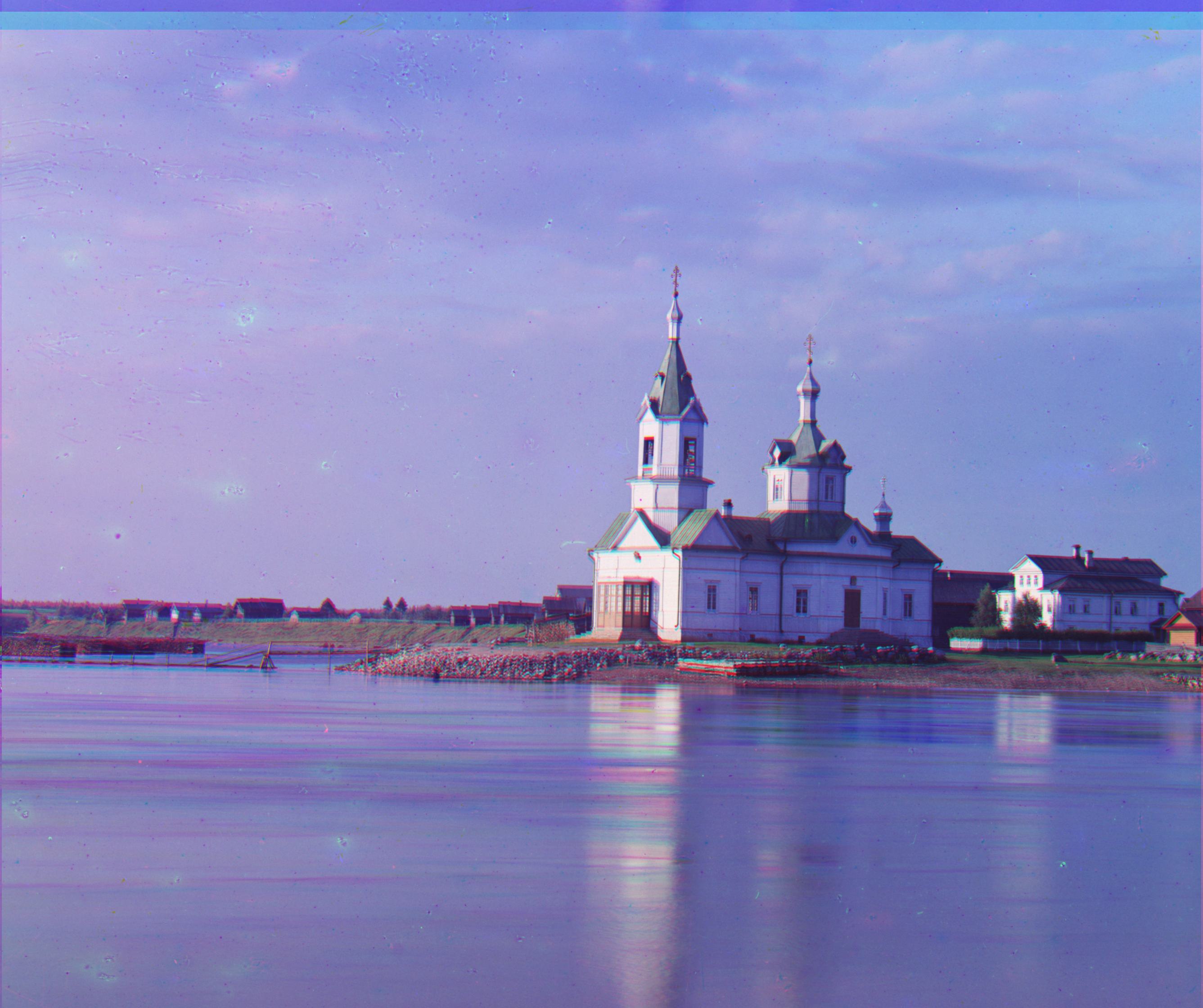
TIF, Blue Base, Depth: 5
Displacement vector G: (4, 26)
Displacement vector R: (-4, 58)
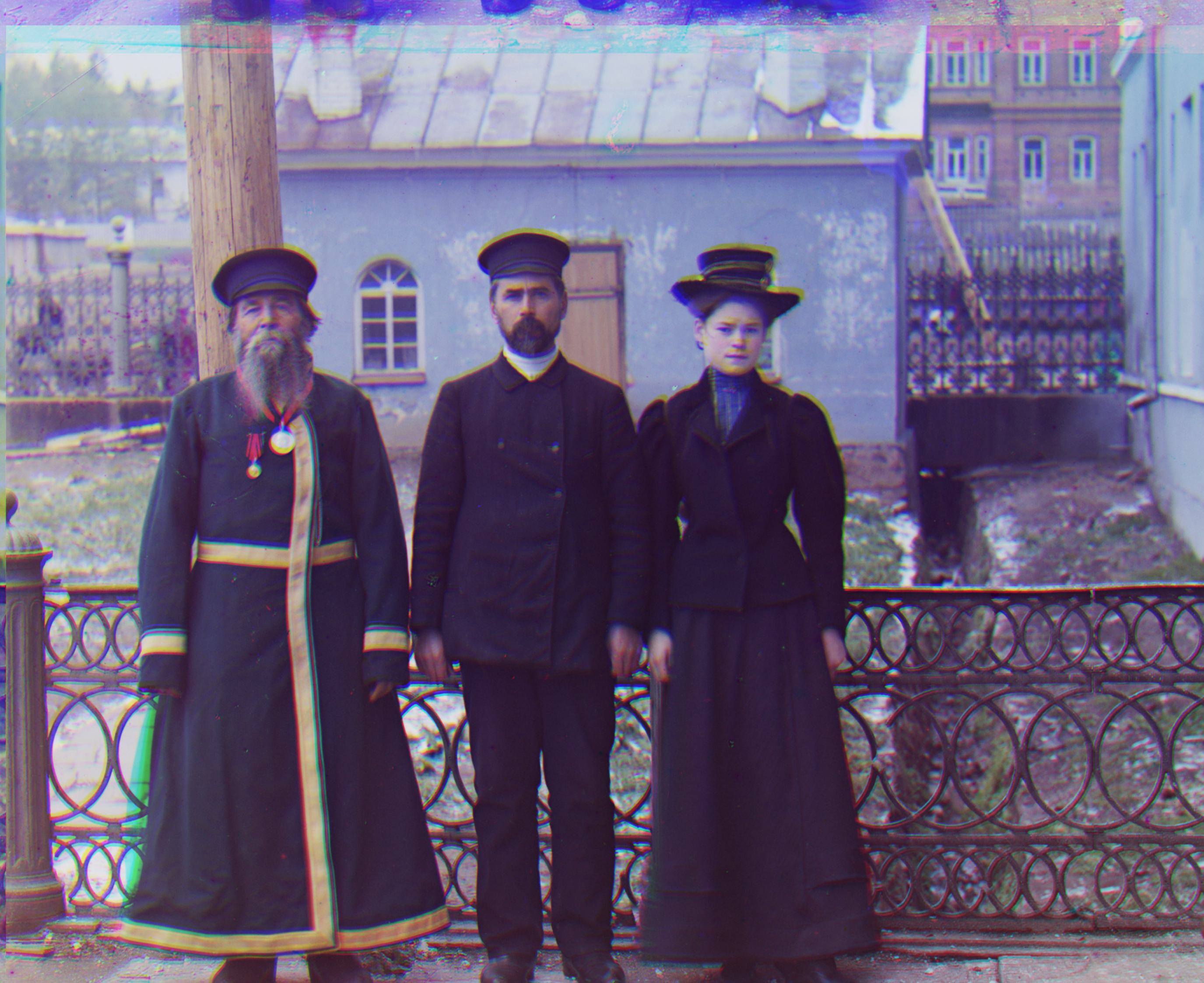
TIF, Blue Base, Depth: 6
Displacement vector G: (12, 54)
Displacement vector R: (12, 62)
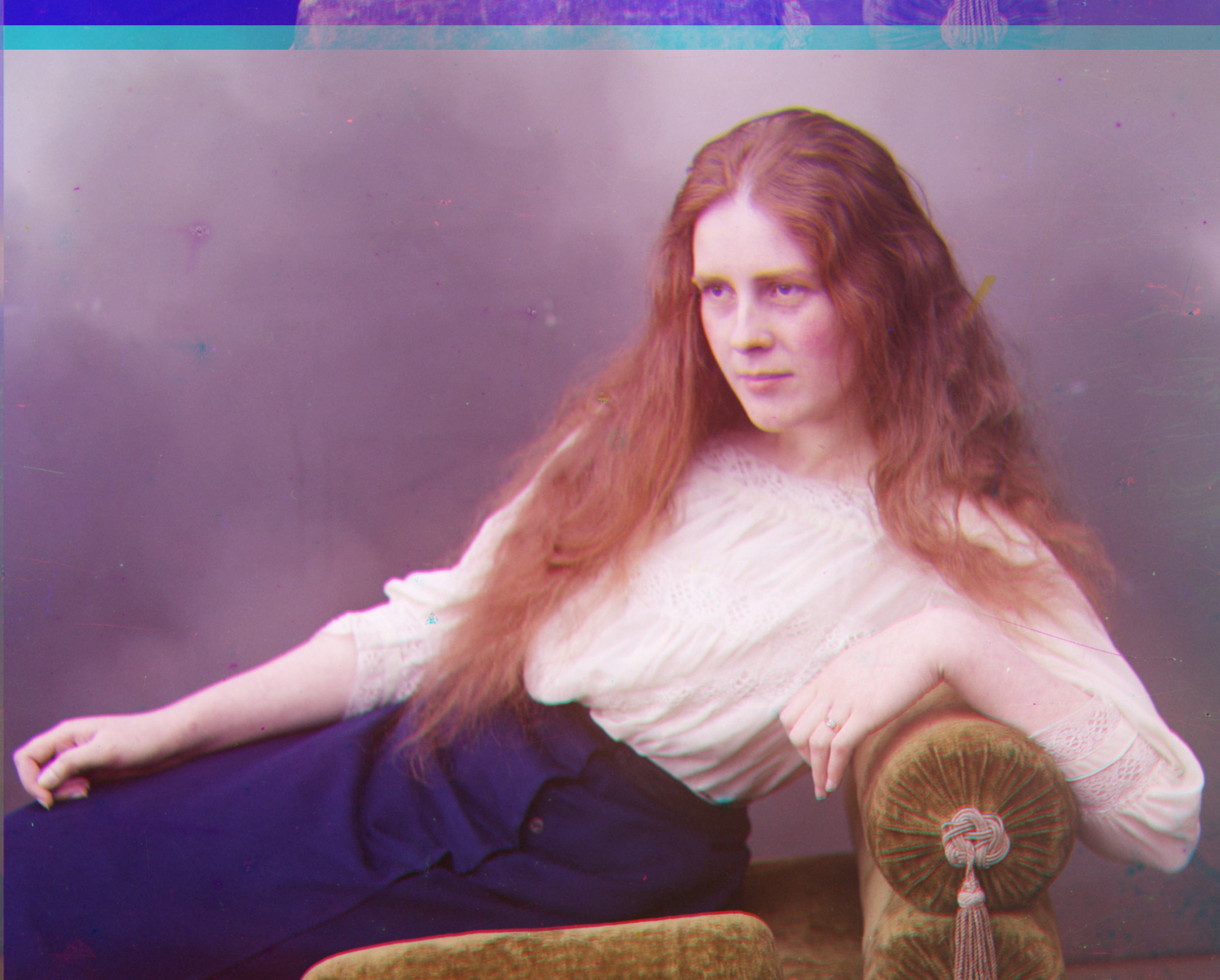
TIF, Blue Base, Depth: 5
Displacement vector G: (9, 54)
Displacement vector R: (0, 62)
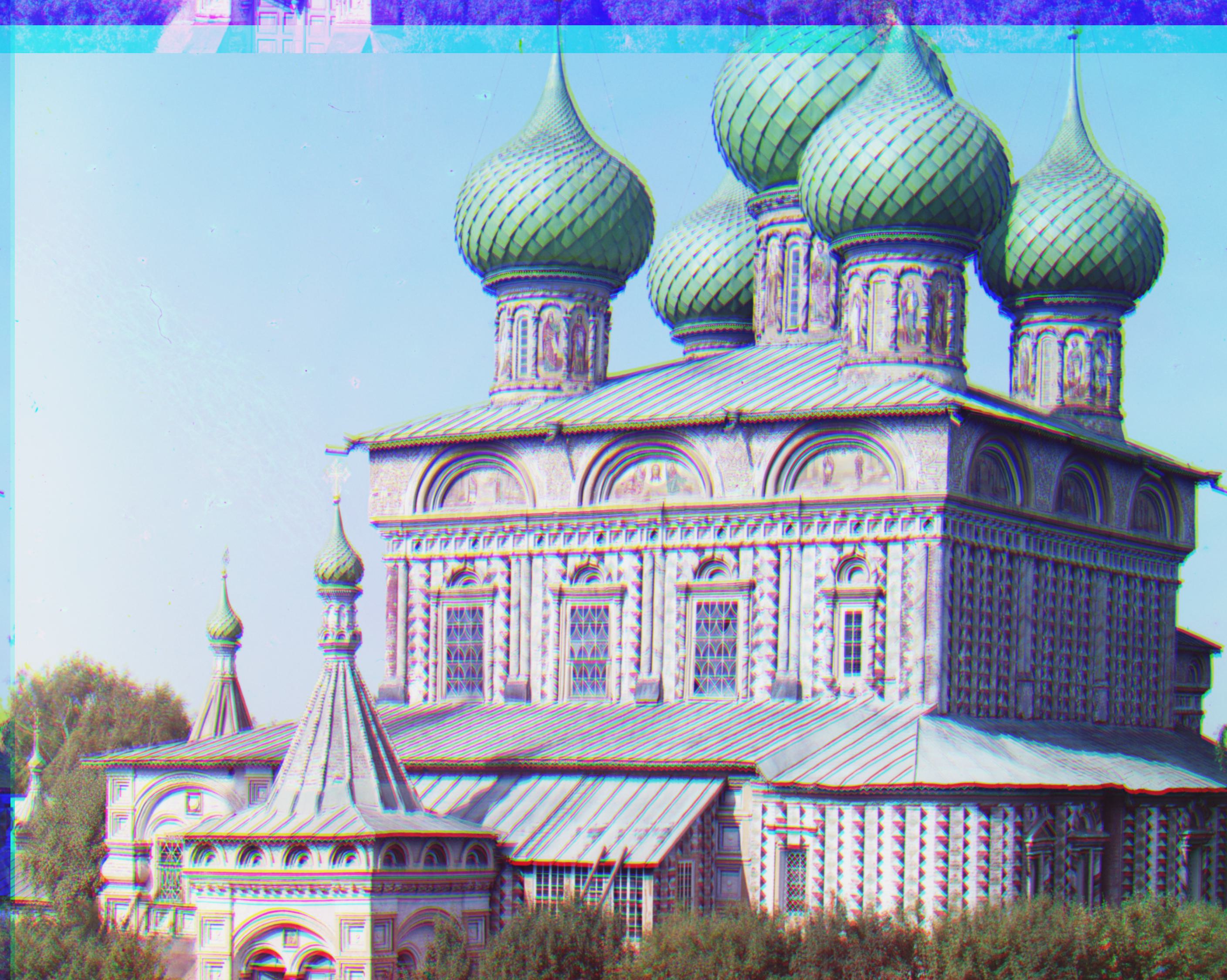
TIF, Blue Base, Depth: 6
Displacement vector G: (26, 54)
Displacement vector R: (34, 62)
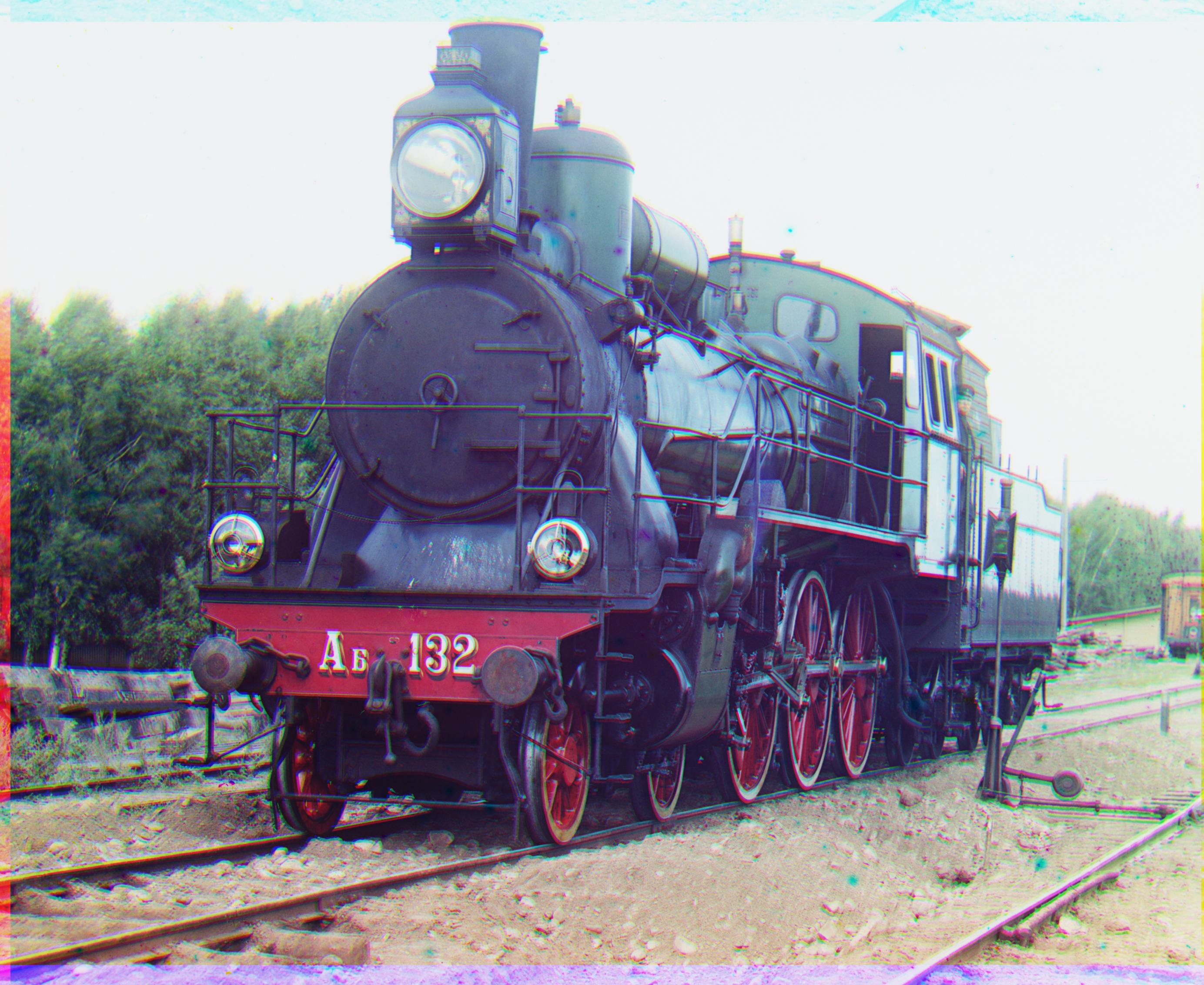
TIF, Green Base, Depth: 5
Displacement vector B: (-6, -46)
Displacement vector R: (26, 46)
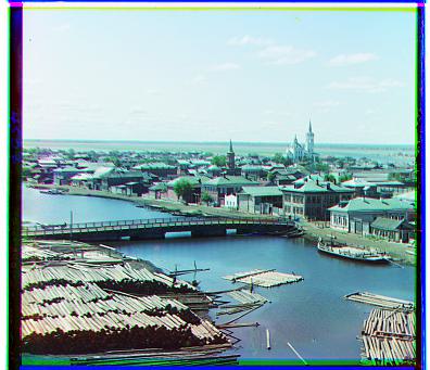
JPG, Blue Base
Displacement vector G: (3, 3)
Displacement vector R: (3, 6)
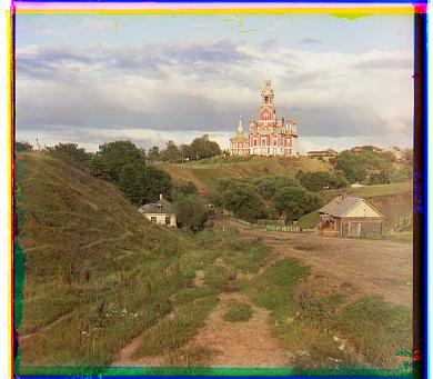
JPG, Blue Base
Displacement vector G: (2, 5)
Displacement vector R: (3, 12)
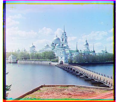
JPG, Blue Base
Displacement vector G: (2, -3)
Displacement vector R: (2, 3)
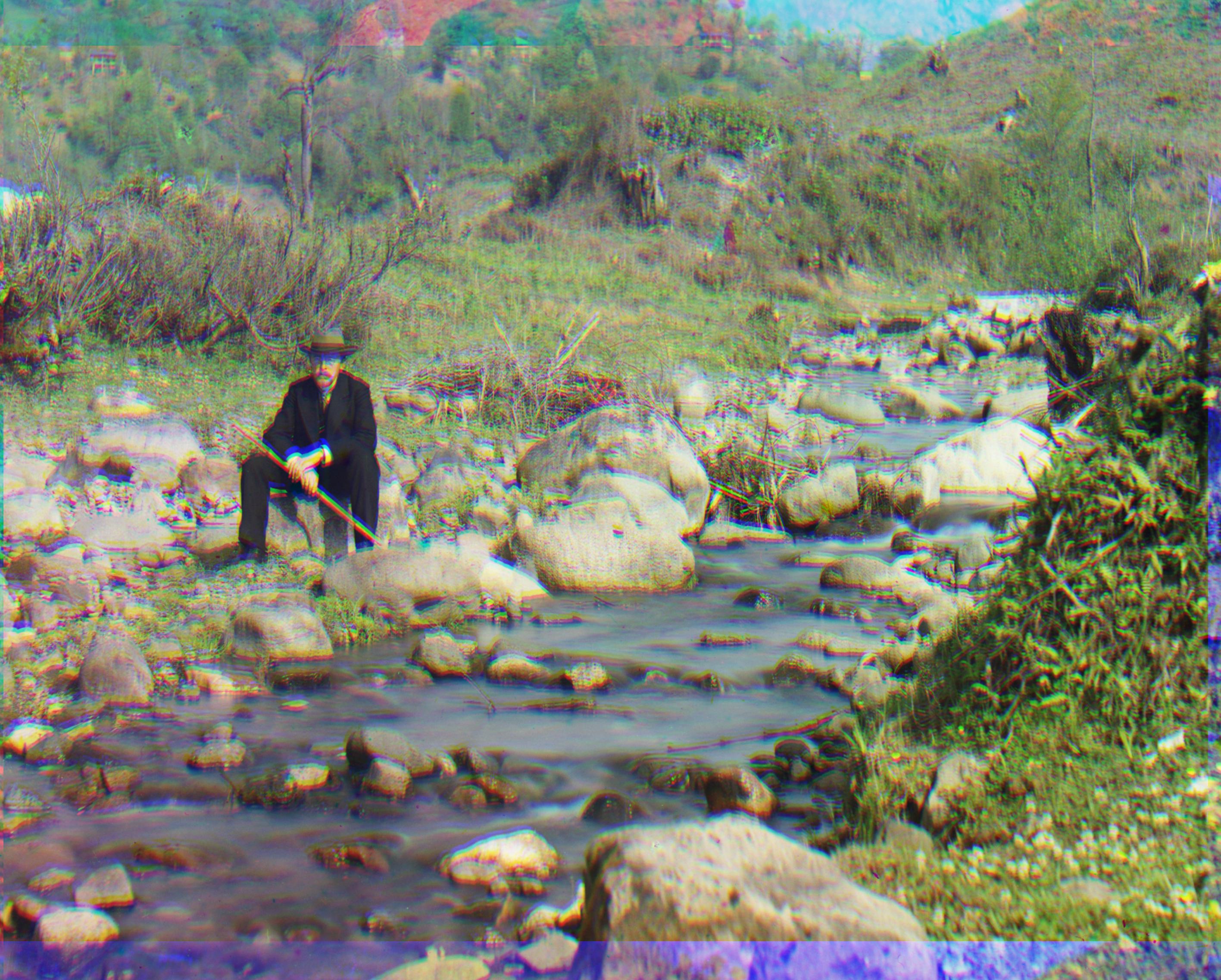
TIF, Green Base, Depth: 6
Displacement vector B: (-22, -62)
Displacement vector R: (6, 62)